Why Use Headings?
Headings (e.g. Title, Heading 1, Heading 2) provide hierarchical structure and organization to a document or page. When arriving at a new page, sighted users gravitate toward headings to quickly find what they want on the page. Screen reader and other assistive technology users can also skip from heading to heading.
Best Practices
- Headings should be used hierarchically, like an outline.
- Document/page titles should always be Heading 1.
- Use Heading 2 for section titles and Heading 3 for sub-section titles.
- Heading levels should not be skipped forward (e.g., if you have a section with a Heading 2, don’t go directly to a Heading 4 just because you prefer the styling on that heading). There are ways to change the styling of headings while still keeping the appropriate hierarchical structure.
- Apply the appropriate heading styles rather than only bolding or enlarging text. Formatting heading text with the appropriate heading styles adds a tag to that text which allows assistive technology to easily locate and read headings.
Heading Example
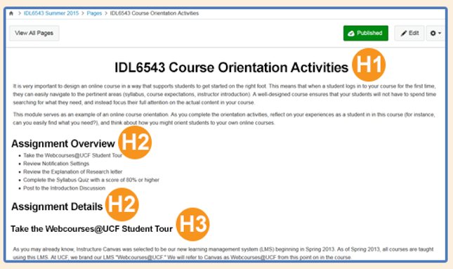
The image below shows an example of the first three heading levels applied to text on a page within Webcourses@UCF.

Resources:
- Microsoft Word: Improve Heading Accessibility
- Refer to Web Accessibility in Mind’s (WebAIM) Semantic Structure: Regions, Headings, and Lists for more information.
- For Webcourses@UCF and Canvas: Canvas Beginner’s Accessibility with the Rich Content Editor
- WordPress Heading Block
- Use WAVE (Web Accessibility Evaluation Tools) to review the structure of a webpage by entering the URL
- Use the UDOIT tool in Canvas and Webcourses@UCF to check for (AND FIX) existing issues related to headings in a course. While in UDOIT, you can check for and fix other accessibility issues as well. Note that UDOIT scans only Pages, Assignments, Quizzes, etc.; it does not scan course files (e.g., Word docs, PDFs, PPTs), so course files need to be reviewed separately for accessibility issues.