Typography is the practice of using the visual style and appearance of text to convey meaning in written communication. It can be used by all roles that use graphic design, web pages, documents, PDFs, or emails to connect with others or share ideas. The goal should always be to present text in a legible and readable way to all audiences.
Legibility is a measure of how easily distinguishable individual characters and words are to the reader’s eye. Readability is a measure of how easy it is to read the text overall. If not considered, audiences with reading, cognitive, or vision disabilities can misunderstand the content and it can slow down reading speed.
To keep accessible text at the forefront of the creation process, you’ll want to keep the following elements in mind:
- Typefaces & Fonts
- Font Size
- Line and Paragraph Spacing
- Color Contrast
- Customizable vs Embedded Text
Typefaces & Fonts
While some fonts may look pretty or fit the theme of your design or document, they may be harder to read than others. Inaccessible text will usually have at least one of the following traits:
- Decorative features that prioritize aesthetics Font Size
- Overlapping characters or letters
- Color Contrast
- “Imposter letters” where numbers resemble letters (e.g. Number “1” must look different than uppercase “I” and lowercase “l.”
Always choose ones with simple and clear features that make the characters or letters easily distinguishable from one another. You will also want a consistent font choice throughout the entire document, design, or web page. This will increase reading speed and retention of information.
Serif and Sans Serif
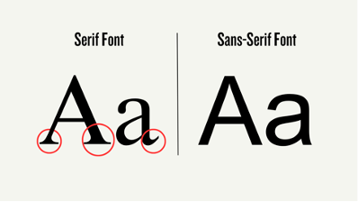
Consider using either Serif or Sans Serif fonts in your text communication. Serif fonts will have small embellishments at the top or bottom of its characters, while Sans Serif fonts will appear plainer and simpler. Serifs are often considered more readable in print communication while sans-serif is more legible on digital screens.

Sample fonts for each category include:
- Serif
- Times New Roman
- Georgia
- Palatino
- Sans Serif:
- Arial
- Helvetica
- Tahoma
- Verdana
- Century Goth
Font Size
Some best practices for font sizes in digital content include:
- Body text at least 12 to 14 points or larger
- Large text is considered 18 points or larger
- Footnotes and endnotes at least 9 points or larger
Please note, headers should use proper heading styles in your content creation platform. Avoid only modifying the size of the text to create a visual hierarchy.
Line & Paragraph Spacing
Appropriate spacing between lines and paragraphs in a document, web page, or email will increase readers’ abilities to keep track and follow along. Some best practices include:
- At least 1.5 spacing between lines
- Generally, do not exceed 2.0 or double-spacing
- Spaces between paragraphs should be at least 1.5x larger than line spacing
- Add indentations to the first line of text in each paragraph
- Number of characters in each line or column should not exceed 80
- Avoid fully justifying lines
Color Contrast
Please refer to the Color Contrast guide for more information.
Customizable vs Embedded Text
If possible, always use regular HTML format when presenting text digitally so readers can adjust the appearance and size based on their needs or preferences. Embedding text into images or videos and not providing a text alternative presents barriers to readers with low vision. For example, some images when zoomed in will pixelate, making the text difficult to read. Screen readers are also unable to read text embedded within media.