Web

The internet has made the world bigger, and smaller. It has enabled an unprecedented exchange of information, giving every communicator direct access to every corner of the globe.
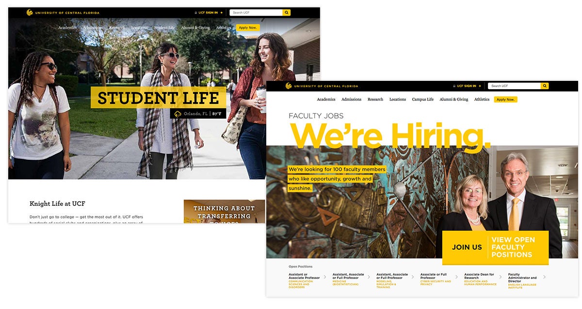
Your website represents UCF to everyone. Literally. Applying these UCF Brand Guidelines when developing websites ensures that each visitor’s experience is clear, compelling, consistent and accessible.
![]()
Ask Yourself:
- What’s the goal of the site? When it’s working great, what specific actions/outcomes will occur?
- Who are you trying to reach?
- How will users get to the site? Do most people find the site via word-of-mouth, Google search or advertisements?
- What actions would you like users to take when interacting with your site?
- Are there forms for users to fill out or business to conduct through some interactive tool/widget on the site?
- Will there be ongoing news, events and updates that need to be communicated?
- Who will be updating the content on this site? How often?
- Is the information you’re presenting available elsewhere on the internet?
- Is there any content on your current site that is being linked to/referenced by other sites? What would happen if that content changes or goes away entirely?
Best Practices
Identify goals and challenges.
What are the core challenges/outcomes that you’re trying to address through your website? Recruitment? Relationship building? Increased awareness? Whatever the purpose, mapping your website goals to fit institutional objectives ensures smart decisions throughout the project and helps produce a measurable ROI.
Assess your communication strategy and competitive positioning (value-benefits).
Do you have a communication strategy and a well-articulated positioning statement? What do you offer and how do you differ from your competitors? These messages should be the foundation of your website, along with user-friendly digital content that is concise, simple and accessible.
Identify and prioritize your target audiences.
Website real estate is valuable, so don’t be surprised when everyone wants to be represented. Decisions about what goes where, information architecture and who gets that coveted home page spot should align with your prioritization of audiences. Deciding early in the process, with your design partner if needed, will save many headaches down the line.
Research the competition.
Get to know what’s out there, the good, the bad, the everything. Drawing inspiration from peer and aspirant institutions can influence your content, information architecture, design and more. Don’t forget to look at other industries for ideas, as well. Keep in mind that this process is all about helping you determine what can be done not just differently, but better.
Decide who’s in charge and identify your stakeholders.
Put a structure in place to keep content fresh, relevant and sustainable. Defining stakeholders will help with governance issues and align your website with your organization’s communication/operational initiatives. If a committee will drive decisions instead of being advisory only, keep it as small as possible to minimize consensus-based decision-making. Above all, fully define and communicate the boundaries of their authority and influence.
Establish a project plan and a budget.
Consider the cost of building versus buying. Even if most of the work is done in-house, you may want to leverage the expertise of outside copywriters, proofreaders, photographers, designers, HTML programmers, etc. A full-service, turnkey solution — with design, strategy, messaging, content development, migration, etc. — can be expensive, but you can keep costs down by being organized and having clear goals and messaging.
Measure and analyze.
Understanding your statistics and analytics will help you prove ROI for your efforts. What metrics are important to track? Start with the basics, like the number of visitors, time on site, bounce rate, event/click tracking and source of the visit. Try to determine which pages are the most viewed and shared, which have the most traffic via organic search keywords and which lead to key actions such as scheduling a visit or applying.
Write for the web.
Creating digital content is unlike writing for any other medium. Because users consume content differently online than they do in print, effective web content should be simple, brief and accessible. To maximize the impact of your words, make them action oriented, concise and feature the most important information first. Consider our Writing Guidelines when creating web copy.
Use visual elements wisely.
Photography, video, graphics, charts and other visual elements can be highly effective storytelling tools online. They can improve readability and offer useful context for scanning users. However, generic, low-quality or purely decorative elements can distract users from your message. Utilize our photography guidelines and the UCF Marketing Photography Collection to help improve your visual impact.

Every UCF website should:
- Represent the core ideals of the university: bright, fast-moving, innovative, accessible.
- Be mobile optimized/responsive.
- Load in less than 1000 ms.
- Be ADA and WCAG2 compliant for accessibility.
- Work in the newest versions of Chrome, Firefox, Safari and Edge.
- Have a dedicated content manager who’s responsible for keeping the site updated and a technical point-of-contact who’s accountable for security and uptime.
Helpful Brand Assets for Web Projects
UCF Header Bar
Logos and Identity System
Front-end Framework and Web Style Guide
Writing Style Guide
Typography
Colors
Photography Assets
Video Assets